Now that you’ve purchased an LED Sign, how do you guarantee your return on investment? It’s time to put your LED sign to work for you. Here are our basic tips and tricks for making legible and eye catching sign content for an LED display.
Tip #1: Determine Your Message for Your LED Sign
Think about how you can say what you need to, in order to get a reaction from your drivers, as quickly and simply as possible. Most drivers have only 5-10 seconds to read your message & commit it to memory. Keep things simple and to the point. Not only will reducing the information give them more time to analyze your LED content, it gives you more room on the LED sign to make your text as big and bold as possible. Here’s an example:

By keeping your message short and simple, but also enticing, you’re more likely to get a response from your audience.
Tip #2: Make it Legible and Appropriate
Choosing a font can be tricky, but it is a crucial step in LED sign design. You should choose a font that fits your industry. You can also use the font choice to imply a mood or attitude as well. A doctor’s office should shy away from “goofy fonts” like Comic Sans, and lean more towards dignified fonts like Optima.
You also need to make sure when choosing a font, you’re using ones that will be bold and legible on your sign. LED signs are not like computer screens. They often cannot portray thin, script or handwritten fonts. Bold sans serif fonts are much easier to read on an LED sign, especially from a distance. When using decorative fonts, make them big, bold and bright.

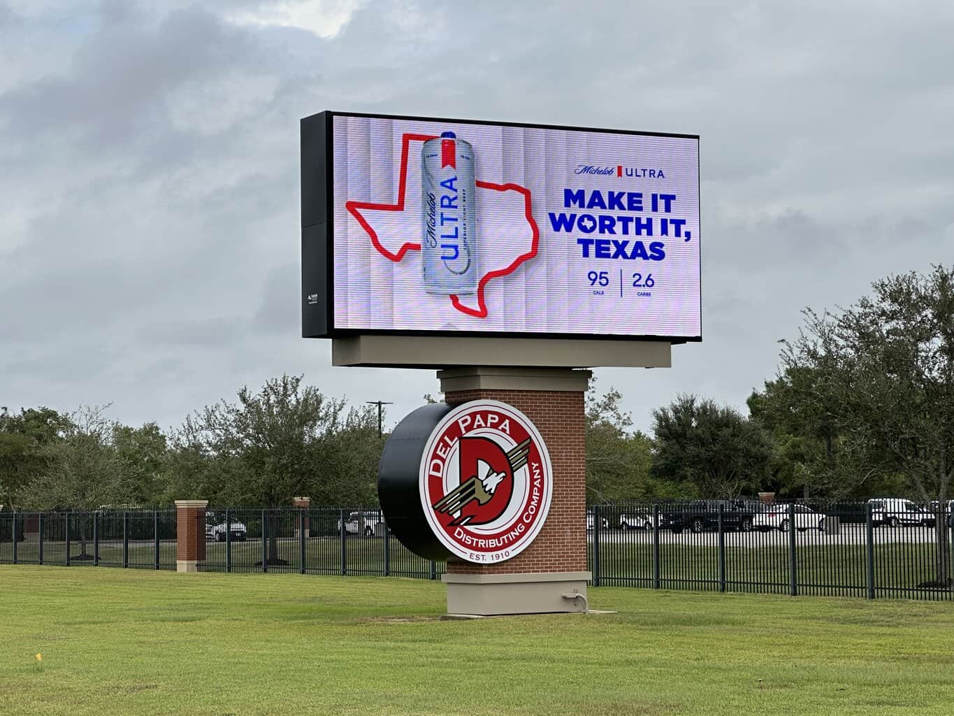
Tip #3: Use Contrasting Complimentary Colors in Your Sign Content
On an LED sign, white is made by utilizing all 3 of the LEDs (red, green, and blue) shining at their brightest. The color black is no light coming from the LEDs. Therefore, lighter colors like white, yellow, light blue and pink are going to be more legible than darker colors because they utilize all the LEDs and are shining brighter. Using a darker background and black outline on your text also enhances the contrast and legibility. You can use the color wheel to find complimentary colors.

So remember: use bright text, darker contrasting backgrounds, and black outlines on your text whenever possible.
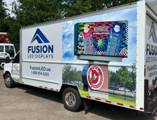
Tip #4: Use Pictures Wisely
How to use graphics and pictures on your LED sign is one of the most asked about topics during software trainings with our clients. In reality, every sign and every picture is unique. However, we have some general tips that should help.
- Make them big. You picture should take up 30-50% of your display area/message.
- Keep it simple. Zoom in on the face of a person, rather than showing a head-to-toe shot. Try using silhouettes or simple illustrations rather than detailed pictures when possible.
- Make sure it contrasts. As we said earlier in this post, black is no light passing through the LEDs. So if your picture is fairly dark, it will not show well on the sign.

Tip#5 Make Your LED Sign Content Pop
The whole point of owning an LED sign is to get noticed and gain something from your audience. Make sure that your ads are not only standing out from your competitors, but also from your own property. Analyze your sign’s surroundings and make sure you’re not just contrasting ON the sign, but AROUND it as well. If your sign is mounted on or near a brick wall, try and stay away from reds and browns that will make your message blend into the scenery. The same goes with blue skies and green trees.
If you are allowed to use animations and movement on your sign, take advantage of it. A simple video background or entrance effect on your text can really help catch your audience’s attention that much more.
For more information on the programs Sign-Express Graphic Designers use or help making unique and effective content for your LED sign, contact us at Artwork@Sign-Express.com or by phone at 800-888-5051.


